
 We gathered outside at some ungodly hour of the morning, shivering and weighed
down by backpacks. Soon we’d be on our way to Durham, North Carolina for
HackDuke, a hackathon unlike any other I’d attended. Instead of the usual
anything-goes hackathon event, HackDuke’s theme of “Code for Good”
encouraged participants to create projects that benefited society.
We gathered outside at some ungodly hour of the morning, shivering and weighed
down by backpacks. Soon we’d be on our way to Durham, North Carolina for
HackDuke, a hackathon unlike any other I’d attended. Instead of the usual
anything-goes hackathon event, HackDuke’s theme of “Code for Good”
encouraged participants to create projects that benefited society.
HackDuke Begins
We woke up to a beautiful morning on the road just outside Duke campus and after an opening ceremony featuring former IBM engineer and current Durham Mayor, Bill Bell, I set my sights on… socializing. I used the opportunity to meet and talk to my brilliant fellow hackers and learn from some of the mentors.
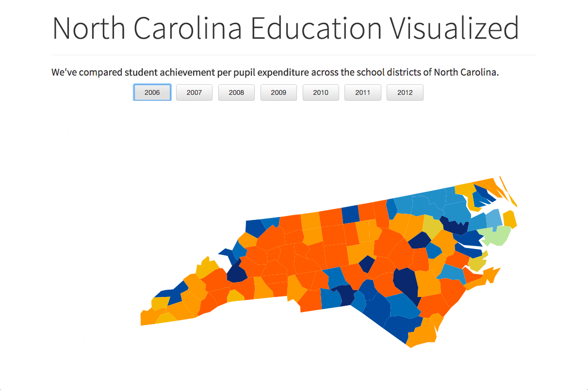
There were four main tracks for the hackathon: Inequality, Energy and the Environment, Education and Healthcare. After asking around and talking to a series of awesome mentors (shoutout to Baris and Sandeep from Google and everyone from Code for America Durham), we settled on making some sort of data visualization for education.
We were pointed to d3.js as the best tool for the job and also warned that it would not be an easy too to use. But first, we had to gather the data to visualize.
Googling Searching, Scripting and Data Parsing
We spent quite a bit of time Google’ing and looking for data sets. Since we didn’t set out with a specific final product in mind, it was a bit of a challenge. A lot of time was sunk into looking at various school district websites and looking for data sets.
We finally found the North Carolina Public Schools website and downloaded quite a few excel spreadsheets. From there we split up, tackling both the visualization and the data parsing at the same time.
Thinking that doing that data parsing “wouldn’t take that long” was the biggest misconception we had. Despite having (relatively) well-formatted Excel spreadsheets, each of them were slightly different, changing year to year, and made Michael’s life a nightmare.
“Using” d3.js
Having no actual experience with d3.js, we just tried to find and modify existing d3 code to fit our purposes. It was not easy and our final implementation was a thoroughly hacked together hackathon project. Magic numbers were everywhere and guess and check became the development process of choice. Surprisingly, we finished in time with a working prototype.
Flaws and Improvements
Technical issues aside, I have doubts about the statistical validity of our data visualization. We set out to measure the “performance” of different school districts in North Carolina. To do this we chose “cost-effectiveness” to quantify and that in and of itself can be viewed as a controversial choice.
Cost-effectiveness boiled down to average SAT score divided by per-pupil expenditure. This ignores year-over-year improvement and also puts far too much emphasis on a single standardized test, implying that the “success” of a school district depended on their students’ performance on the SAT test.
We wanted to try to show the change in performance but due to time restraints and a lack of expertise in the topic we couldn’t do that effectively. Instead we generated the same map for different years and let the viewer switch between them to see the change from map to map.
Knowing that socio-economic status plays an enormous factor in academic performance (especially in standardized testing), we tried to control for it by making two categories “wealthy” and “not-wealthy” demarcated by the federal Title 1 designation. Although this seemed reasonable at first, it also ended up being a major confounding factor.
The crux of the ineffectiveness comes from the individual year maps. Because we never accounted for year-over-year changes, changes in Title 1 designation could drastically change the indicated success of a district.
As the economy plummeted in the late 2000’s many districts gained the Title 1 designation. When this happened, many districts previously judged as under-performing low-end wealthy schools became high-performing high-end not-wealthy schools and heavily skewed both their own perceived standing and that of the entire data set.
I seriously doubt the validity of our choice in metrics because in the end, our main data point boils down to SAT point per dollar spent. It ignores many confounding factors and making broad assumptions and assertions on the goal of education.
That being said, I still think the concept itself is valid. Had we crafted a metric to properly associate dollars spent and increase in performance then the visualization itself could be immensely useful. But since that was not the case then our one-off hackathon project is more of a technical demo than useful tool.